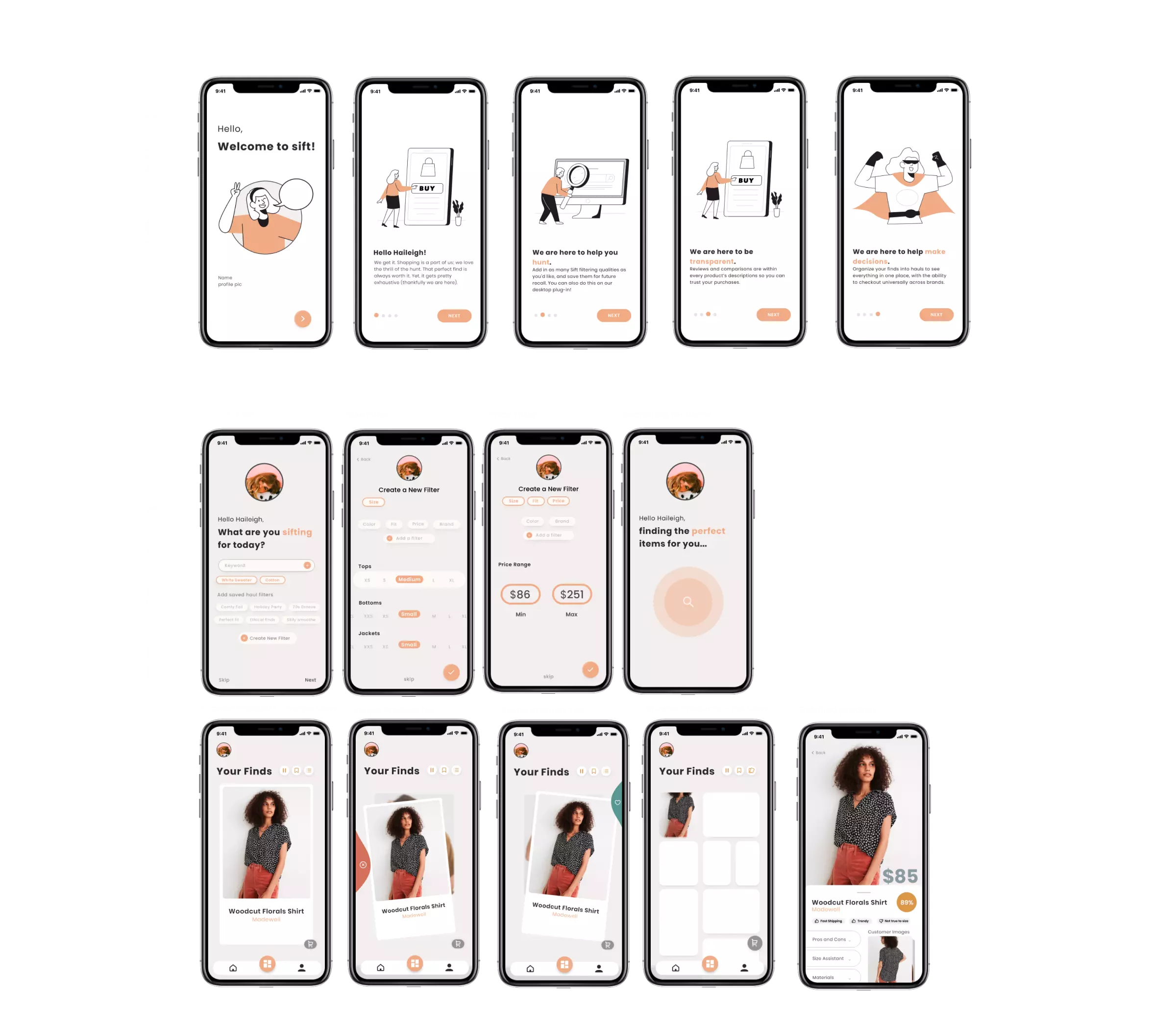
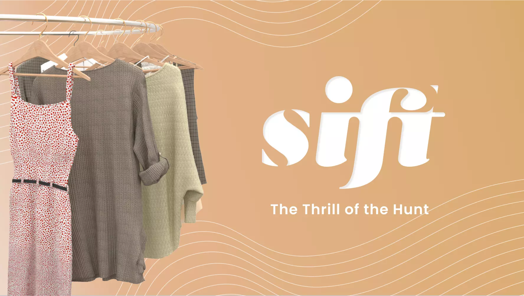
Sift
Enjoy the thrill of the hunt!


Enjoy the thrill of the hunt!
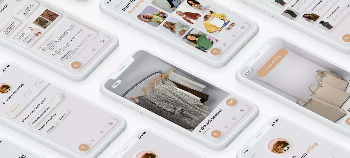
Sift is an app and desktop plug-in that assists with the user’s hunt for finding clothing by universally filtering, using 3-Dimensional interactive models, emphasizing transparency, and saving products to organized hauls.
Sift aims to create a platform that increases the enjoyment and the efficiency of the fashion hunt while still producing the joyful feeling of finding the perfect product. Through the curation of the perfect amount of products, Sift alleviates the exhaustion caused from browsing through excess products, all while keeping the shopping experience personal and inclusive for the differences between individuals.
The physical retail space industry has fallen by more than 35% in recent years.
Right now, e-commerce fulfills shopper's utilitarian needs, yet overlooks the hedonic needs of these shoppers.
The retail market is, and has been, shifting towards primarily online usage, preferring e-commerce to fill shopping needs. As in-store shopping availability declines, there are critical experiences that are not being replicated in the shift towards e-commerce. Right now, e-commerce fulfills shoppers utilitarian needs, yet overlooks the hedonic needs.
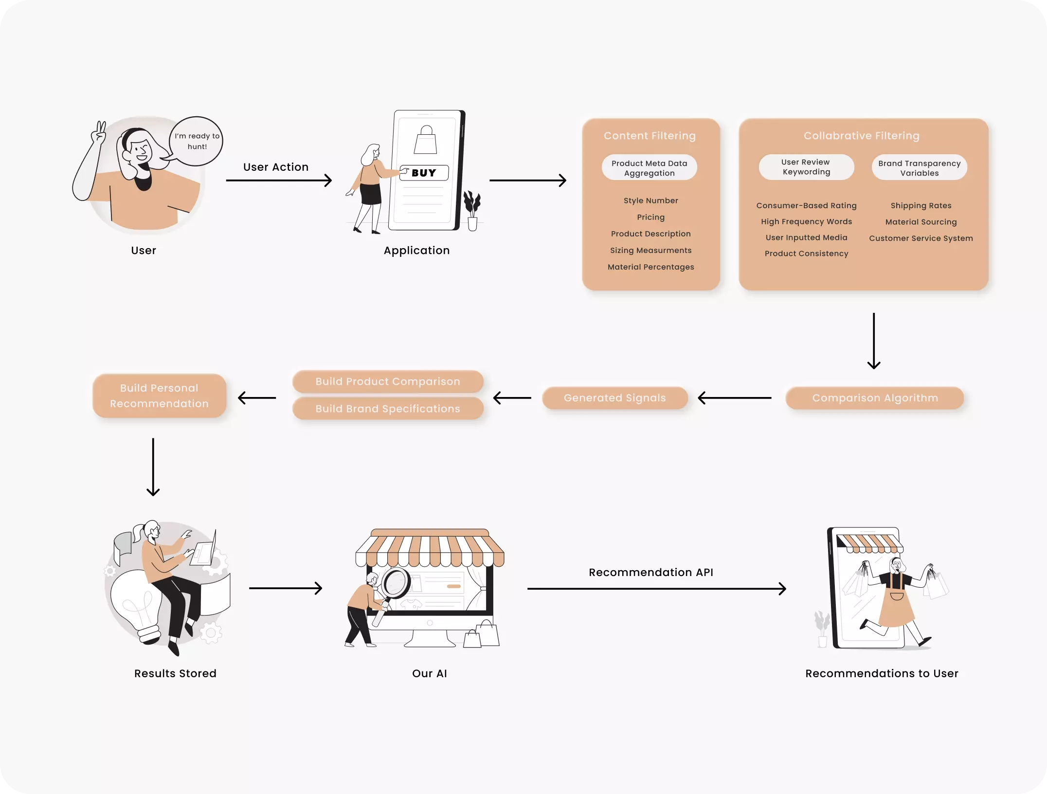
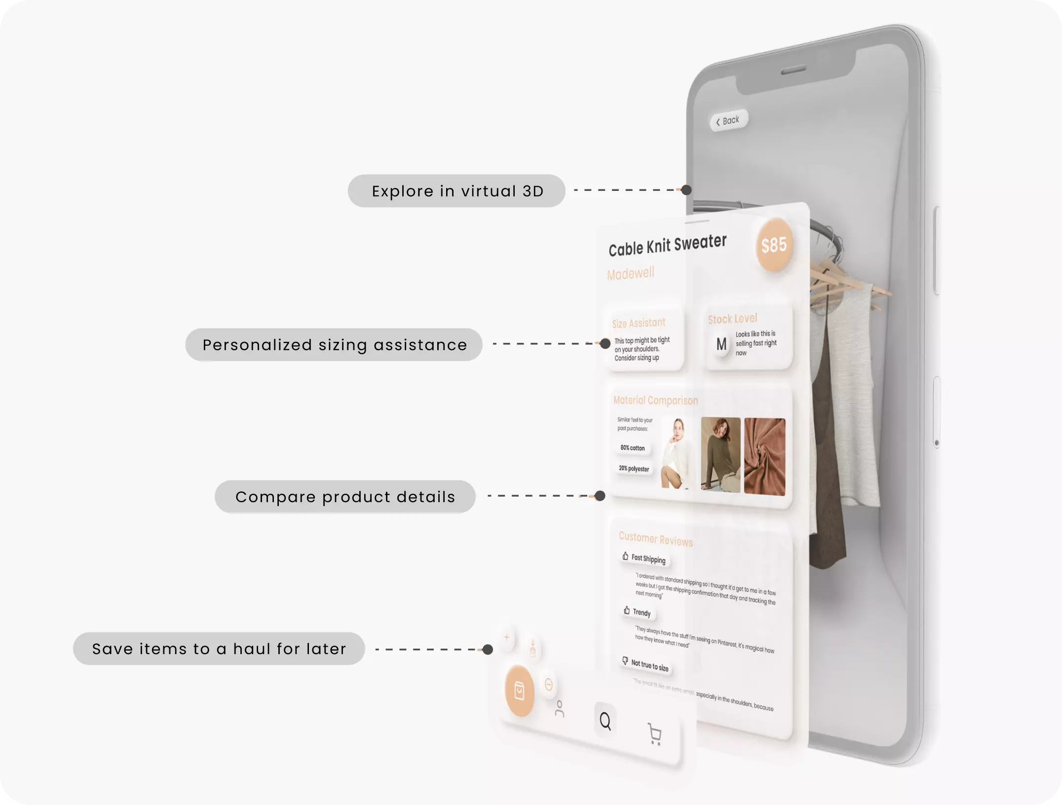
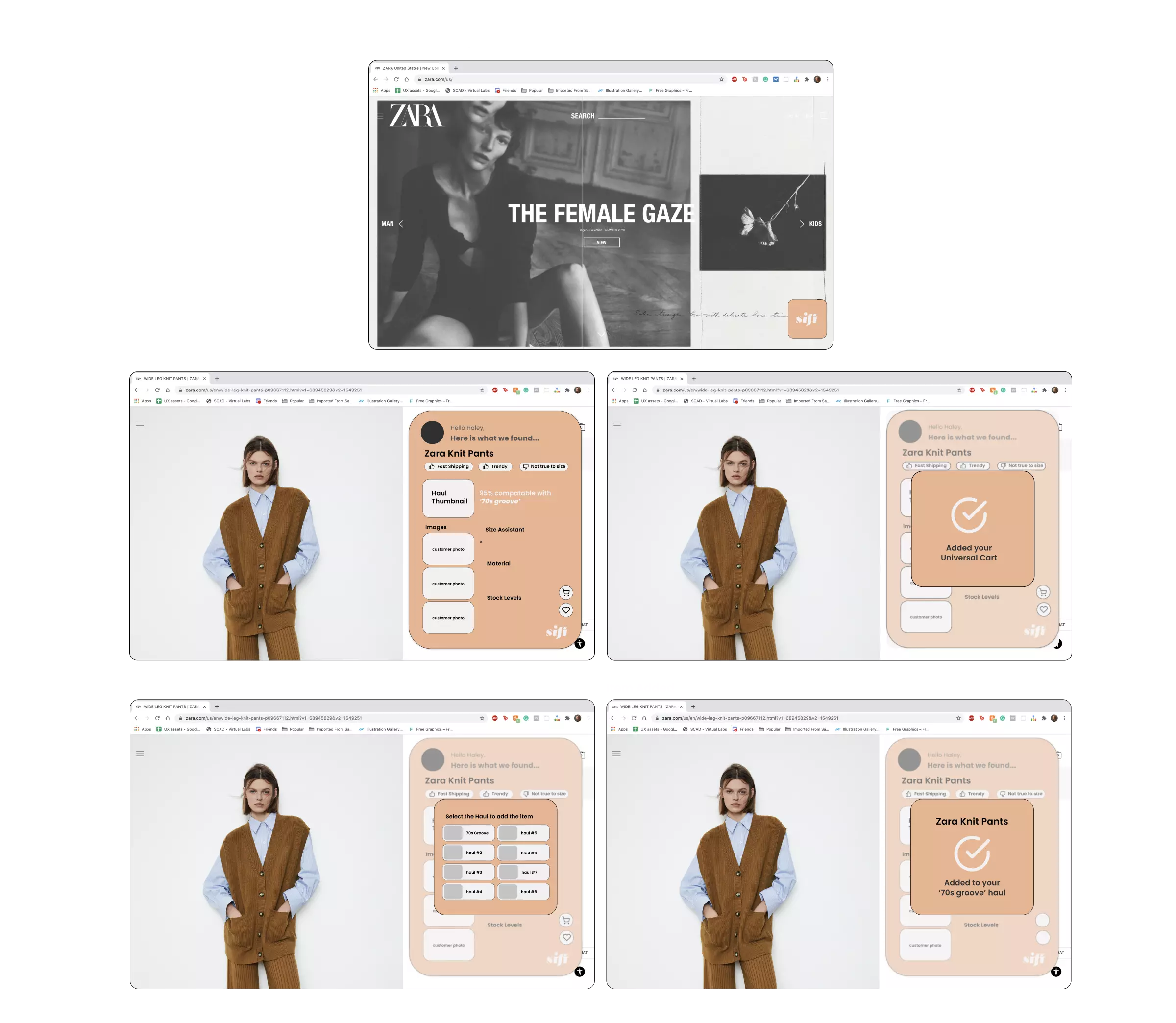
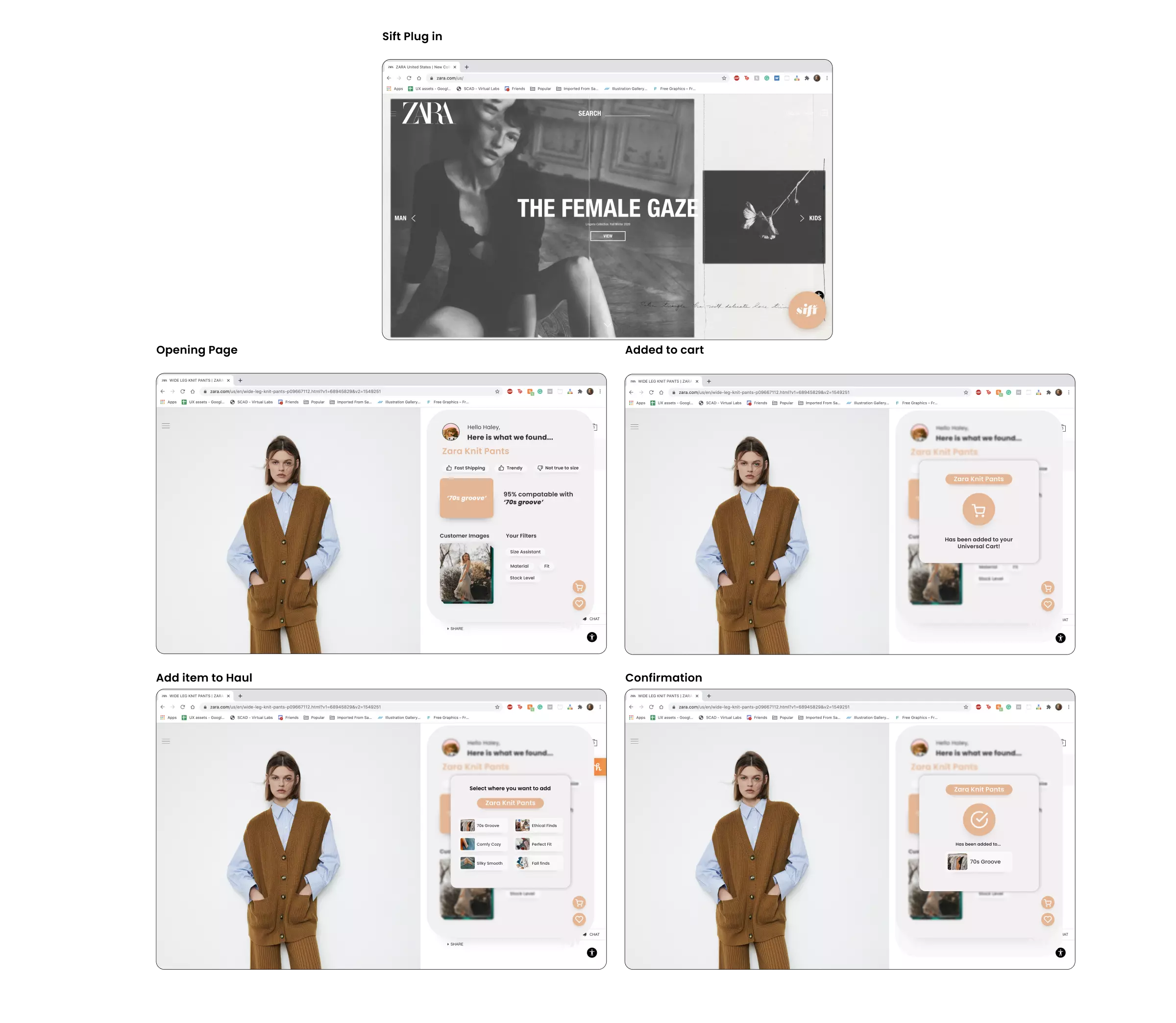
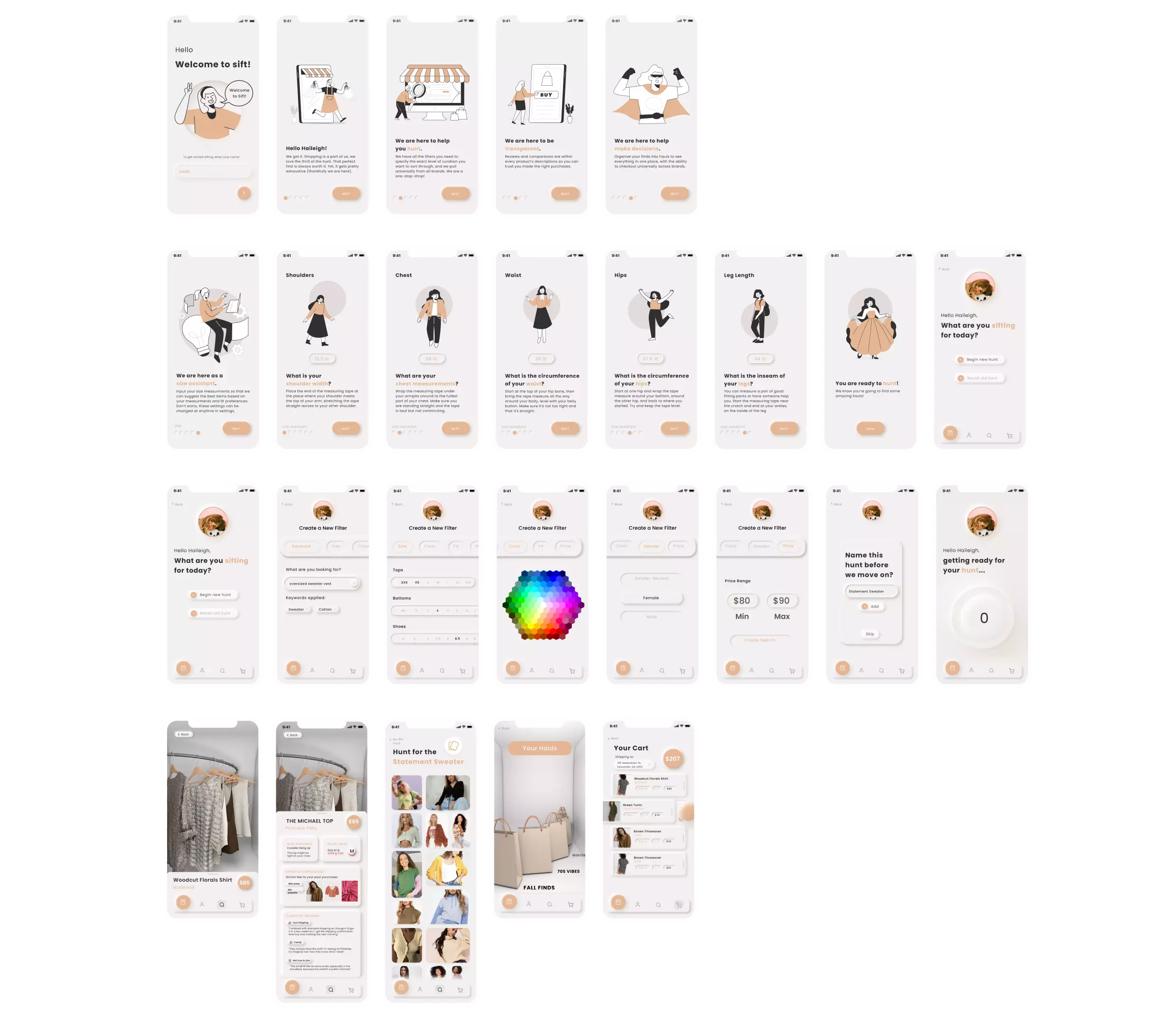
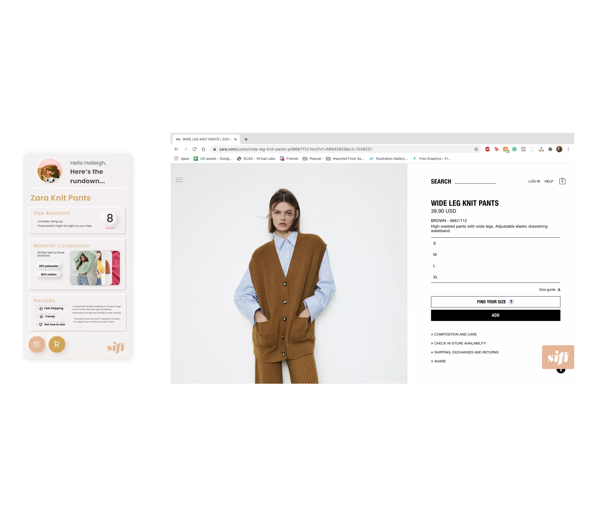
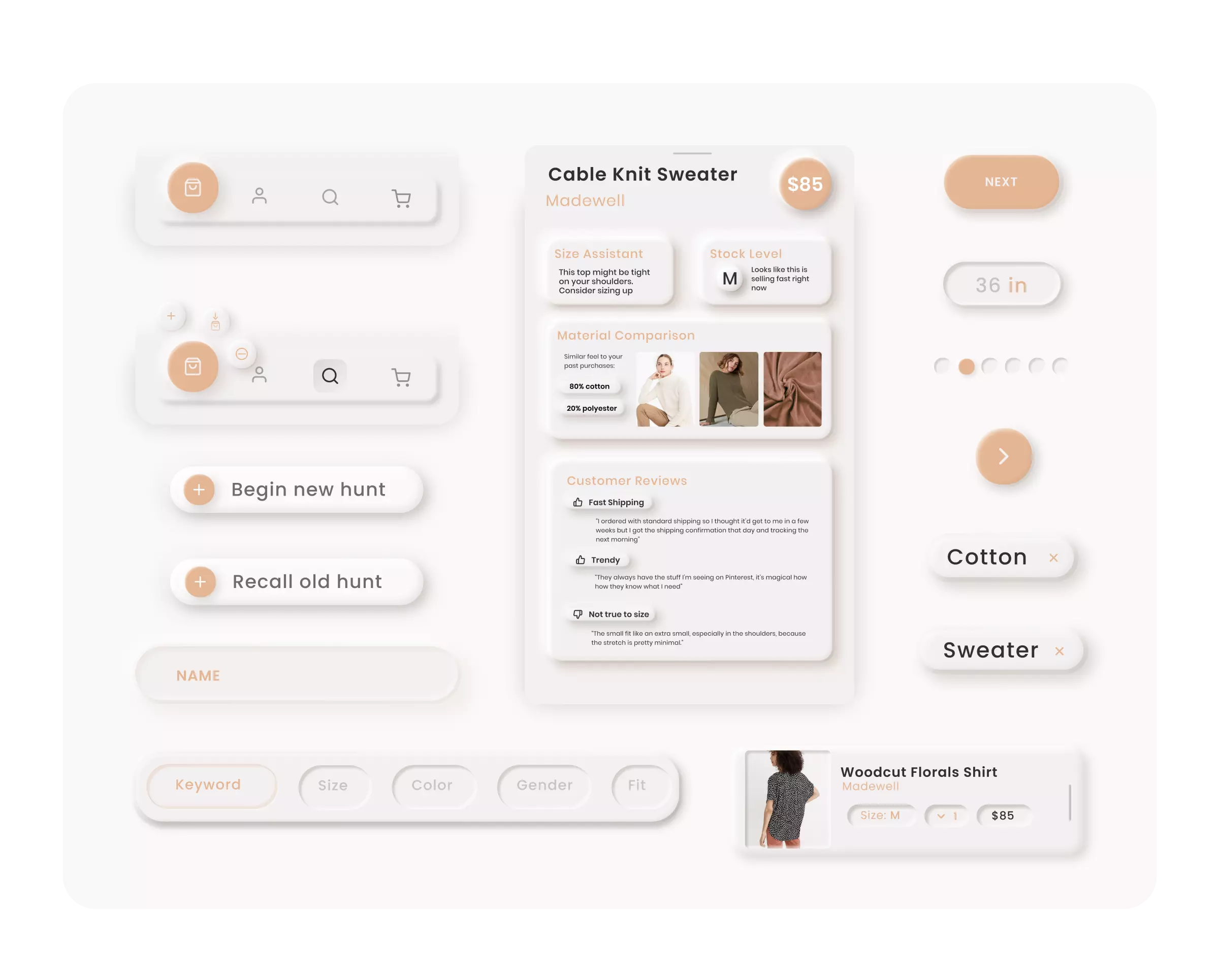
Sift offers a unique online shopping experience through several interactions and features. With 3-Dimensional interactions, Sift mimics the mental model consumers have with the physical. Personalization is a big part of the success of Sift. With the personalized size assistant’s help Sift will find you the perfect item. Along with the sizing assistant, Sift has fully customizable categories to create your ideal product comparison. Sift features a custom product comparison algorithm that filters the perfect amount for ease of searching, which can then be used to help save items to organize in hauls to refer back to later.
Set personalized filtering preferences that Sift applies across all brands, allowing users to compare fashion items more efficiently.
Habitual shoppers across online platforms strive to find the perfect fashion piece. These shoppers are committed to hunting down a purchase they are proud of and feel confident in. Yet, the continual scrolling through endless products and comparison across brands becomes exhausting, ultimately decimating the thrill of the shopping hunt.
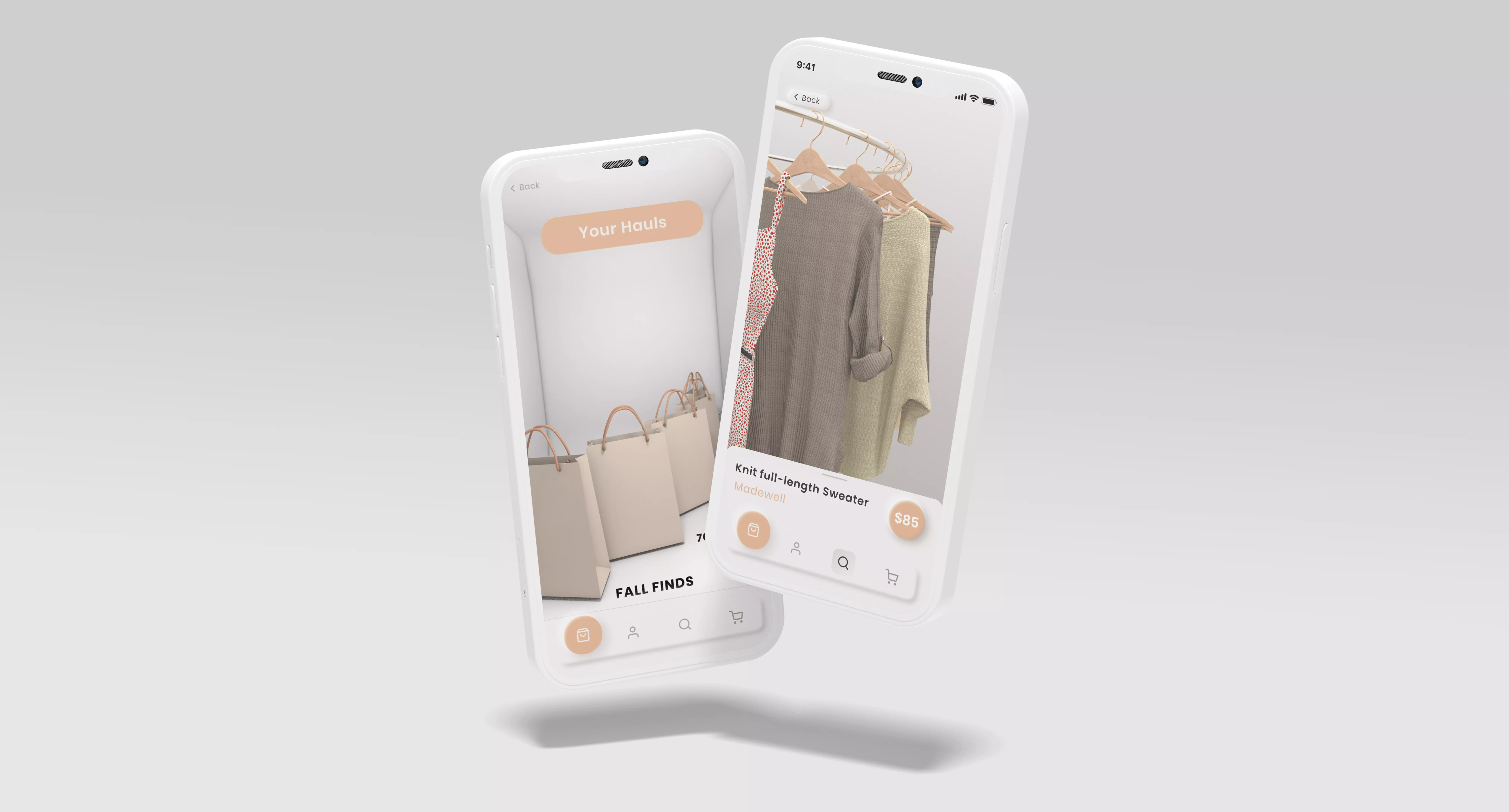
Save all your favorite items for now or later. Compare saves and find the best product for you!
Mimicking in-person clothing racks, users can swipe through an interactive 3-D view of products to accurately assess the form and quality of the product. Within the specific product pages, there are curated reviews, material comparisons and sizing assistance for a holistic understanding of the item before saving.
Sort all saved items into hauls that are organized based on user curation. Prioritize and rank products within hauls to encourage ‘round-based’ decision making.
Mimicking the satisfaction of walking out of a store with a bag, Sift offers saved haul bags. Using 3-Dimensional interactions users are able to easily organize and prioritize items for later to compare against other items. This allows users to streamline online purchasing much like in-store shopping.
Comparison Algorithm
All the comparison and filtering with none of the heavy lifting!
To better personalize each individual user, Sift features a comparison algorithm for both product filtering and brand filtering. Each attribute is assigned a numerical value. Values are then compiled to create a string individual to the brand and product. Our AI technology compares and ranks numeric values. Results are displayed within product specific pages and brand transparency characteristics.
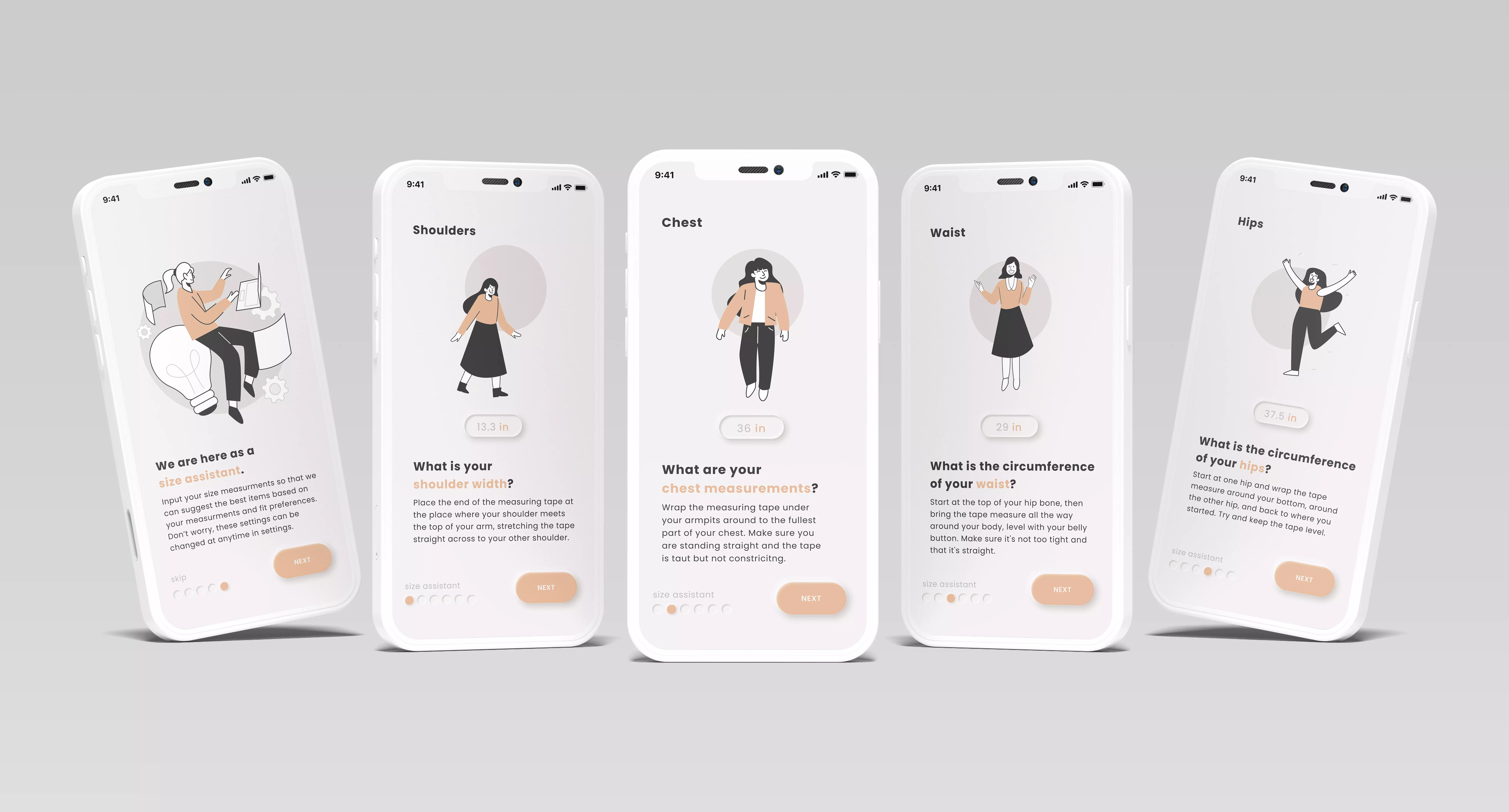
Sift Size Assistant
Finding the right size is hard. Don’t worry, Sift has you covered!
The Sift size assistant is introduced in the initial on boarding. Users follow the measuring prompts on each screen and input their corresponding measurements. The size assistant is not only a way to mimic in person shopping interactions with a store associate, but also allow Sift to better personalize your sifted items based on your fit preferences. All measurements can be changed in the profile tab of the app.
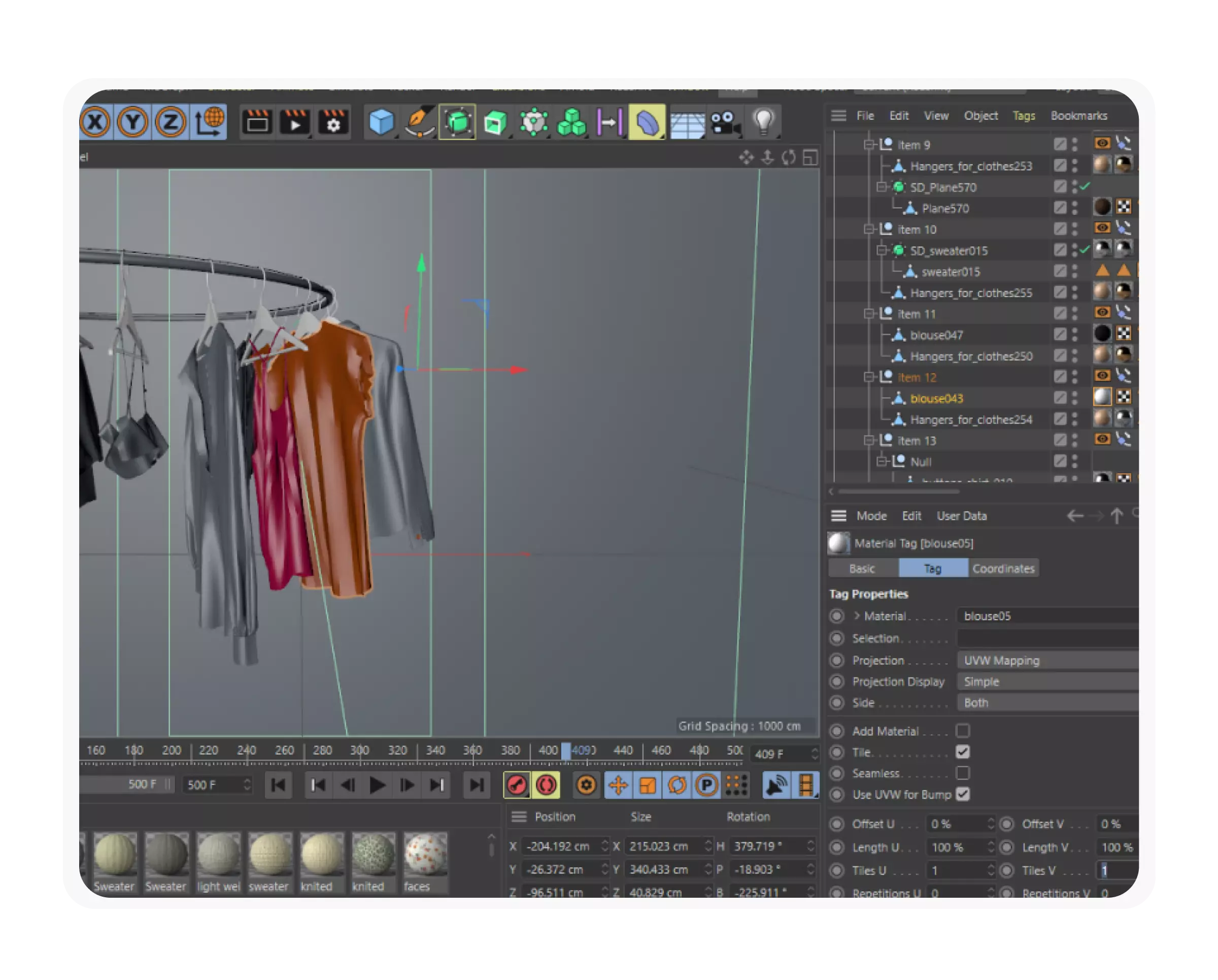
3D Clothing Search
The entire mall in the palm of your hand!
Using Maxon Cinema 4D I created a 3-dimensional clothing rack. This interaction allows the user to interact with Sift in a way that mimics the in-person shopping experience. The rack is filled with the items that make up your filtered search. By using a 3-dimensional interaction Sift is able to tap into the hedonic needs when shopping online.
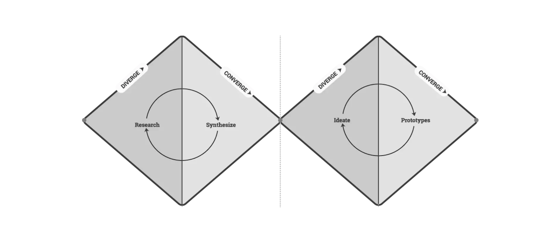
Problem Statement - The birth of the problem statement derived from my team's shared experiences with e-commerce shopping difficulties. This project took place at the beginning of the Covid-19 pandemic when the nation went on lock down, which made the e-commerce industry a vital source of daily entertainment and interaction.
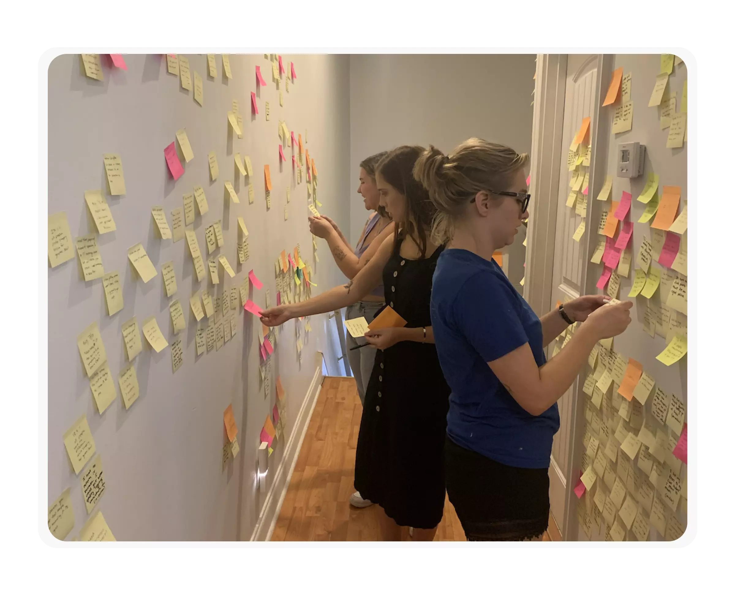
Research - We conducted two weeks of various user research methods. Through these methods we managed to understand behaviors, draw user insights & findings, all to create our design framework.
Prototyping -We began by developing wire frames which we then evolved into our low-fi, mid-fi and high-fi screens that were then prototyped.
Evaluation - Finally, we conducted user testing to evaluate and evolve our design ultimately creating the altri ecosystem.
In summary...
Our first research method was a survey. We received 211 responses. The goal of our survey was to collect quantitative data about the connotations between physical and
online shopping.
As a team we each conducted user interviews, in total we interviewed 16 different users. This was a semi-structured interview with prepared questions and talking points. To keep these interviews more conversational and natural we used these questions more as a guide. Our goal for these interviews was to find out what parts of shopping are enjoyable, and what parts can be improved. We wanted to understand the general motivators behind leisure shopping.
We then wanted to dive into the user's assumptions and perceptions. We conducted a sensory cue and asked users to assess the differences between the assumed quality, textures, and sizes of products from photos to their actual physical qualities. We did this by first showing the image of the item followed by handing them the physical clothing item.
To find patterns in how users use online shopping websites we conducted a cultural probe. With this method, we aimed to assess the most and least used features within e-commerce. We also wanted to find similarities in ‘enjoyable’ sites from various participants.
Key Take-aways
Lack of transparency - Users are frustrated when there is deception around product quality and fit.
How might we provide confidence in quality assurance without having the ability to touch and feel like in-store shopping?
Needs for Personalization - Users enjoy when products that are shown match their individual style and preferences along with information on how these items will fit.
How might we facilitate realistic and personalized expectations for personalized user style and size?
Habitual satisfaction - Users claim they rely on shopping as an exciting part of their routine to relax and enjoy browsing but dislike when it becomes too overwhelming.
How might we curate the number of products to alleviate the exhaustion caused by browsing through excessive and irrelevant products in e-commerce shopping?
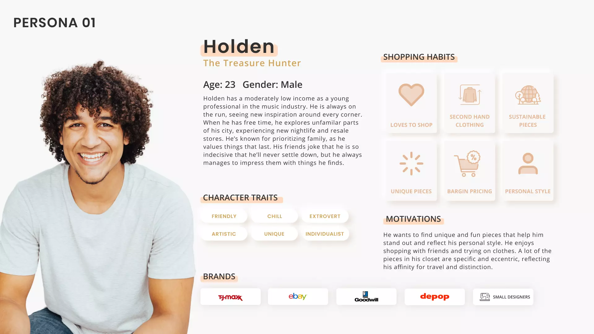
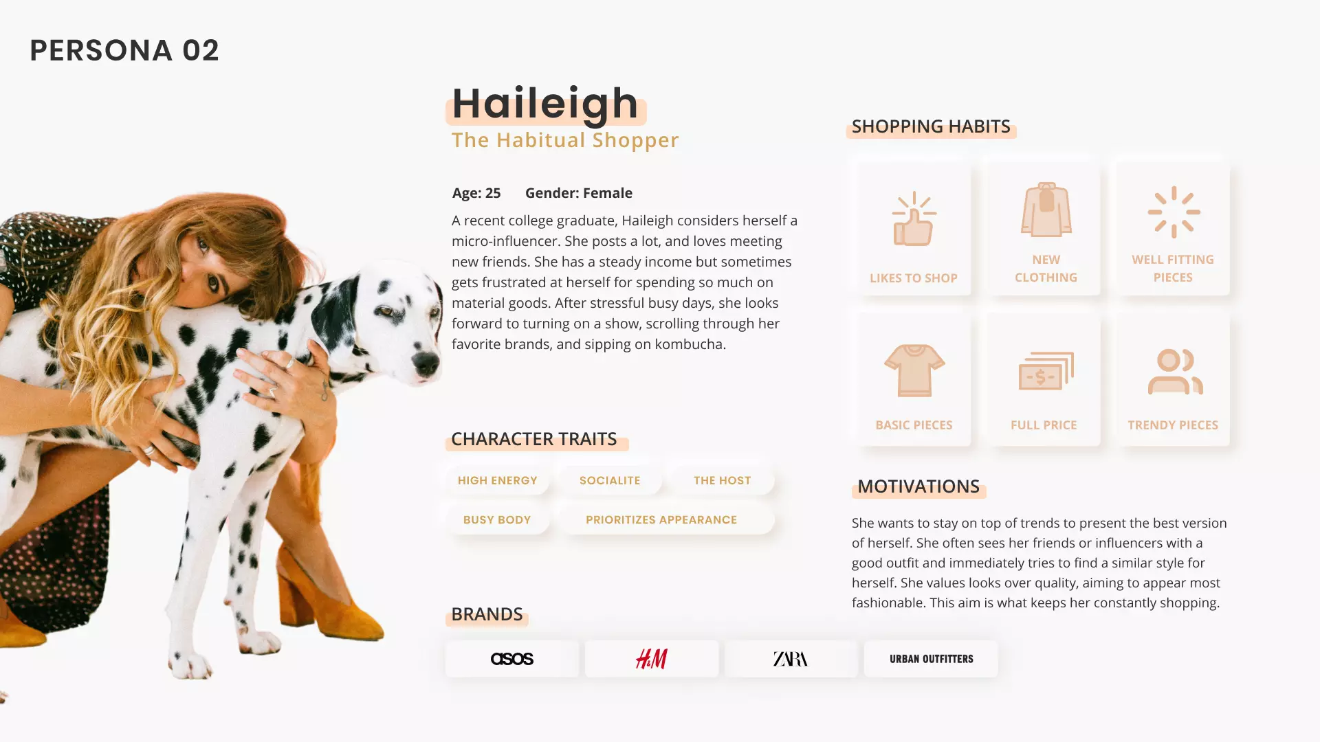
User Personas
Informed by our research, we created two personas to represent our main users, their needs, frustrations and goals.
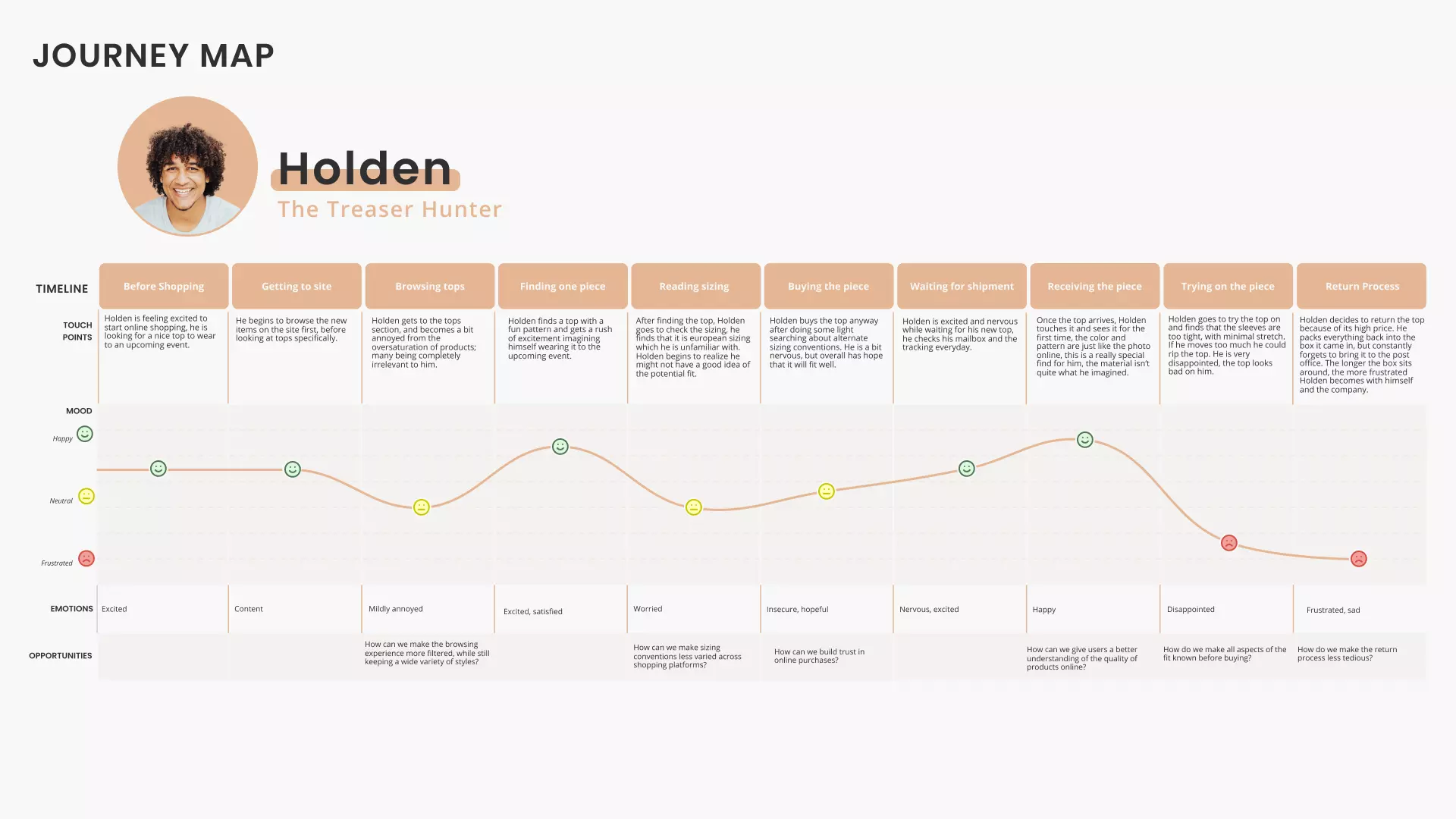
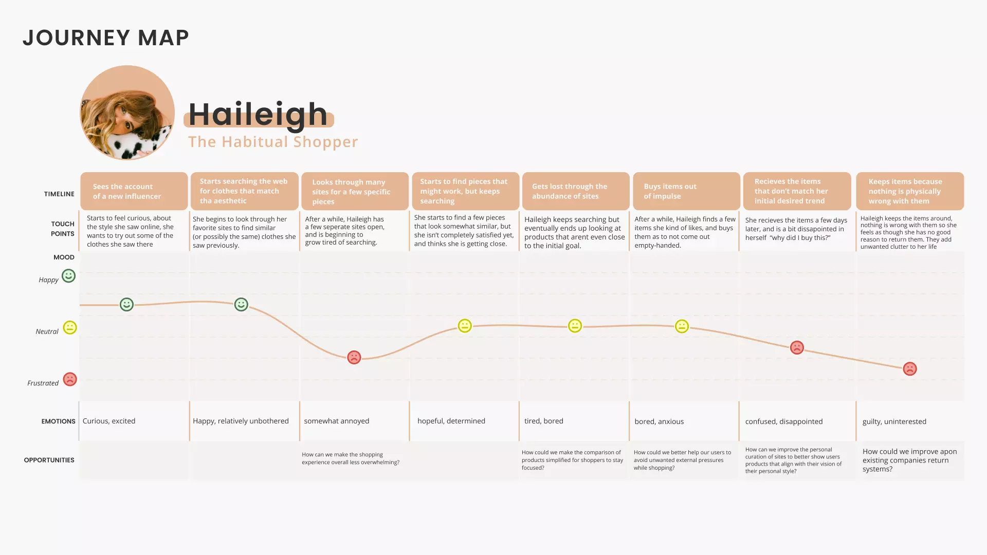
User Journey Maps
Informed again by our research and our understanding of our personas we created two journey maps to represent our users.
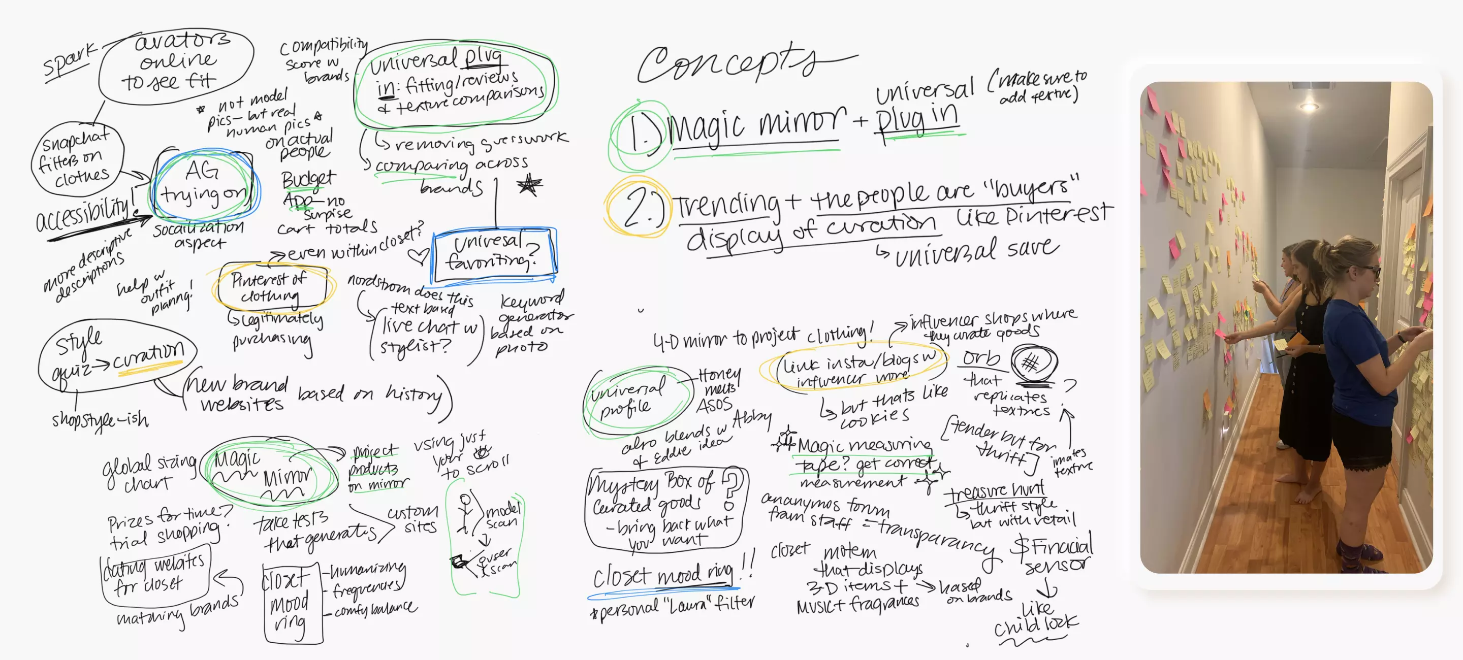
Ideation
With a core understanding of our problem space and user desires, we as a team began our ideation process. We spent lots of hours formulating concepts and directions and eventually
formed the concept Sift!
Wire frames
Our wireframing process was a key phase in our development. We focused a lot on developing the user flow and creating a solid information architecture.
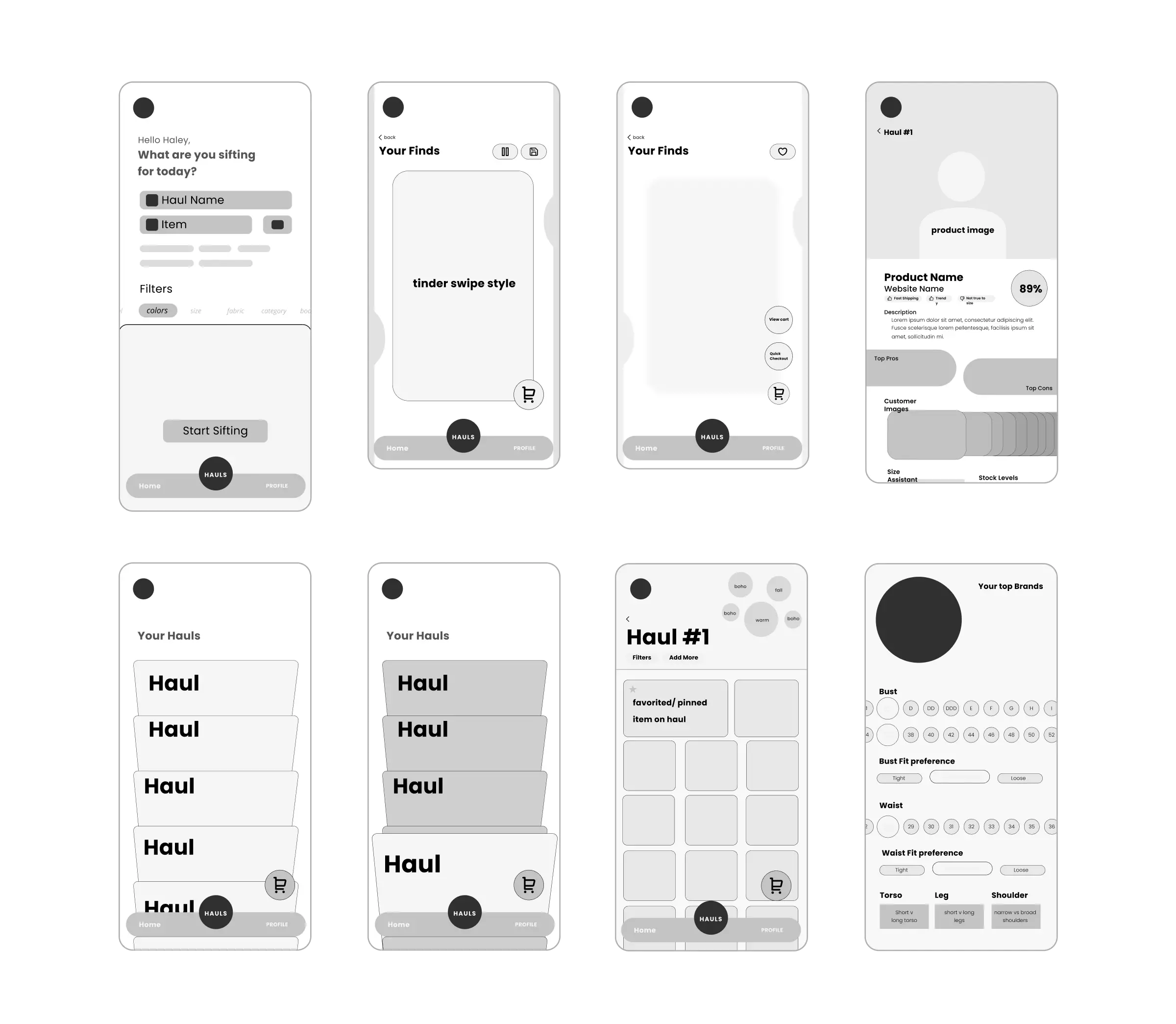
Low - Fi
Once confident in our wireframes I then moved along to create a low-fidelity prototype.
Key Take-aways
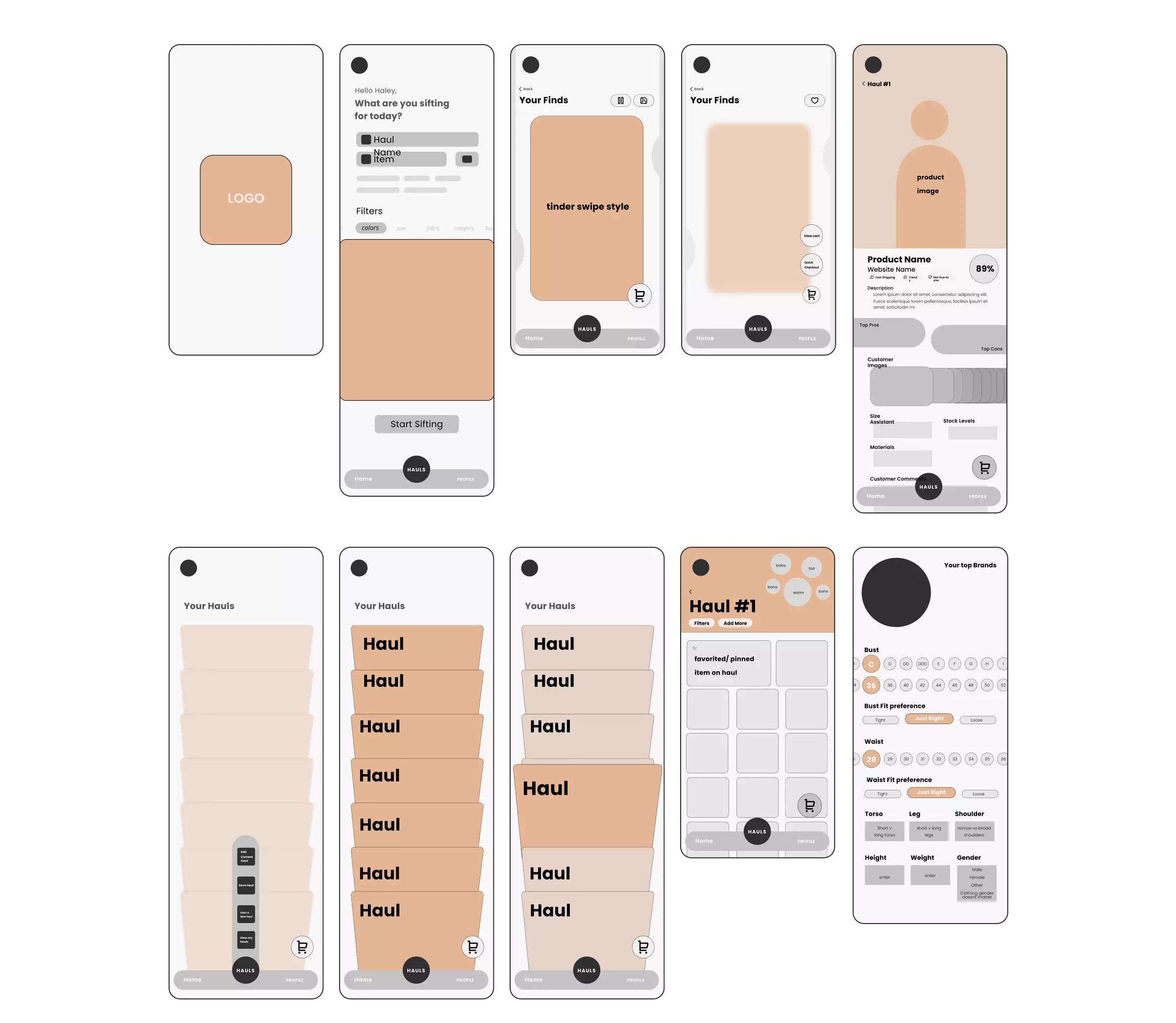
Mid- Fi
Evolving from our low-fidelity and the feedback we as a team received we began creating our mid-fidelity prototyped which we then user-tested on a large scale.
Key Take-aways
What does work...
What does NOT work...
High- Fi
Based on our user testing we created a game plan to easily transition into our high-fidelity prototype development.
Key Changes
Sift Interface
The idea for the Sift interface was to design something that aligned with our 3-dimensional theme of mimicking real-world counterparts of in-store shopping in both how
they appear and how the user interacts with them. To convey this feeling for the user we created a Skeuomorphism / Neomorphism interface. Skeuomorphism makes the interface objects familiar to users mental models by
using concepts they recognize.
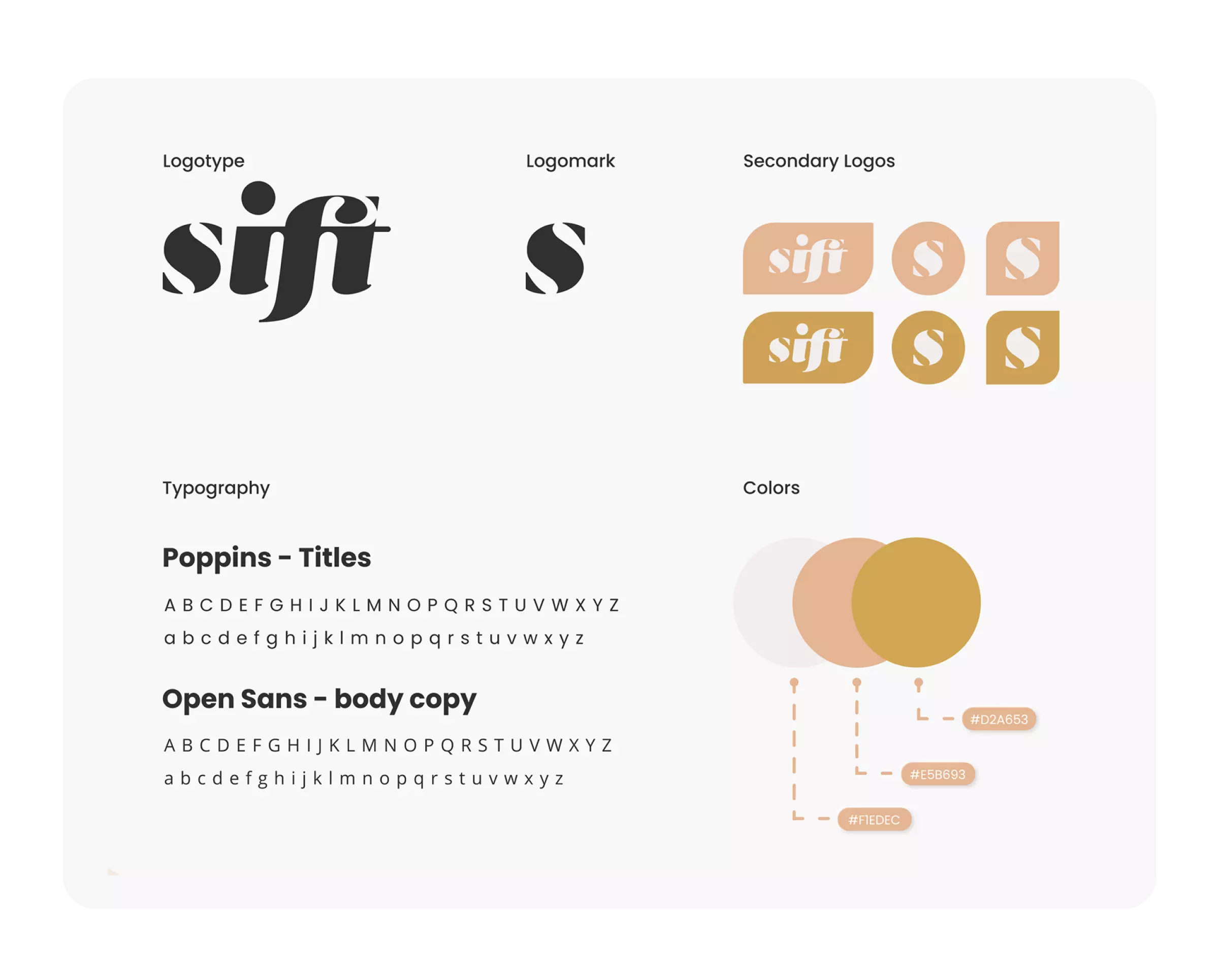
Sift Branding
The aim for Sift’s branding is to keep it clean and fun. Typeface Open Sans and poppins both reflect the idea of Sift by providing a consistent, legible, and friendly typographic
voice. The colors remain accessible and friendly, promoting enjoyment and the efficiency of the fashion hunt.
To read more in depth about each step of the creation of Sift visit our process book!
UX Design Studio 1: Innovation
Professor Sung Park
10 Weeks
09.14.20 - 11.19.20
Laura Ford
Edena Alverado
Abby Turner
Maddy Esper
Taylor Primuth
Visual Design Lead
UI Designer
3D Animator
Prototyping
Taylor Primuth ©2021. All Rights Reserved